With the no/low code revolution that's happening around us, creating a landing page has never been easier.
The real challenge with landing pages is creating ones that convert strangers into leads and potentially paying customers. Although all landing pages share the same goal of increasing conversions, there’s no one-size-fits-all solution.
The design of each landing page will be influenced by several factors, including the target audience, the offer and the conversion goal. Creating effective landing pages needs a fair bit of research; fortunately, there are a few key elements that all high-converting landing pages have in common.
What's a landing page?
Landing pages are standalone web pages that are built with a single focus in mind: to convert a visitor into a lead or a customer. This focus is what makes landing pages so effective; they essentially offer the reader one of two choices:
- Click on the CTA and complete the conversion action.
- Click away from the page.
Landing pages represent a moment of truth for every marketer. Have we built up enough value, trust and confidence in the reader for them to exchange their information or make a purchase?
If the answer is ‘No’ then we need to go back, look at the essential elements and make tweaks to improve our conversion rates.
The Essential Elements of High-Converting Landing Pages
1. A Compelling Headline
The headline is crucial as it is the first element readers will usually see, so it needs to capture their attention and draw them in immediately.
The headline should communicate clearly what you’re offering and why it’s valuable. It should be concise, catchy and convey your message in as few words as possible. It can then be followed with a subheading to provide more detail and highlight what makes your offering unique.
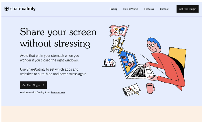
ShareCalmly’s landing page is an excellent example of a headline that draws you in and a sub-headline that expands on the headline.
How to Write a Compelling Headline – 3 Tips
1. Make your headline value-centric: Ensure that the headline's message is all about the benefit/value the visitor will receive by reading on.
2. Be specific: Do 9 out of 10 doctors recommend your product? Then say it with that specificity. Don't rely on general statements like “doctor recommended” when you have the stats.
3. Use subheadings: Subheadings bring more detail, clarity and purpose to your original headline, especially at the beginning of your content.
| TAKEAWAY If readers can't determine the purpose of your landing page from the main headline (and subheading) on the page, you may be missing something. It's a good idea to ask for some external feedback. Often, hearing how someone else perceives your headline will help you clarify whether it has achieved its goal. |
2. Imagery
Use imagery to show your product or to give visual form to the idea that you’re promoting.
When choosing what imagery to include on your landing page, consider what’s appropriate for your target demographic, what will appeal to them and what reflects their interests. Just be careful that the imagery does not distract the reader from the ultimate goal of taking a conversion action.
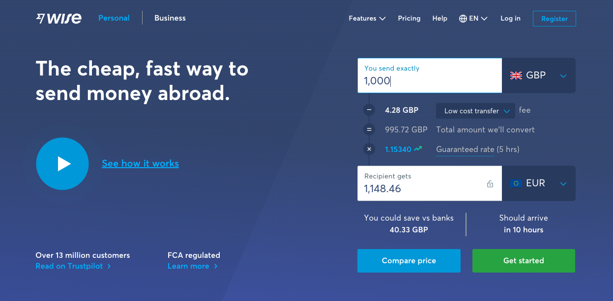
Wise have been smart in their use of imagery and media on their landing page. They have a money converter on the right-hand side that the reader can interact with. Wise uses this converter to build trust. They've also cleverly included a video to show 'how it works', but they have hidden the video behind a CTA button to not distract from the form and interfere with the reader's user experience.
| TAKEAWAY The images and media you use should complement your header and subheading to bring more depth to your offer. A mismatch of these elements may result in the readers being confused and not taking any action. |
3. Engaging Copy
Every element on your landing page needs to work together to persuade your reader to take action. Once you’ve grabbed their attention with your headline and appealed to them with imagery, you'll need compelling copy to move them down the page.
Persuasive copy does the heavy lifting of getting your point across and convincing prospects to convert by highlighting the benefits of your products and services.
Here are more factors to consider when it comes to crafting your copy:
Amount: Too much copy may cause your visitors to feel overwhelmed and leave the page before reaching the CTA. Too little, and you risk not building up enough value, leaving the visitor uncertain about whether you can solve their problems.
Writing style: When creating copy for your landing page, be sure to choose your words carefully. The text you include should speak to your target audience and make clear what you’re offering. You will also want to make sure that your copy is customer-centric.
Formatting: Most people don’t read web pages; they tend to scan through. Use this to your advantage through various formatting techniques, such as bullet points, numerals, lists, bold and italic fonts to draw their eyes to the most important information in your copy.
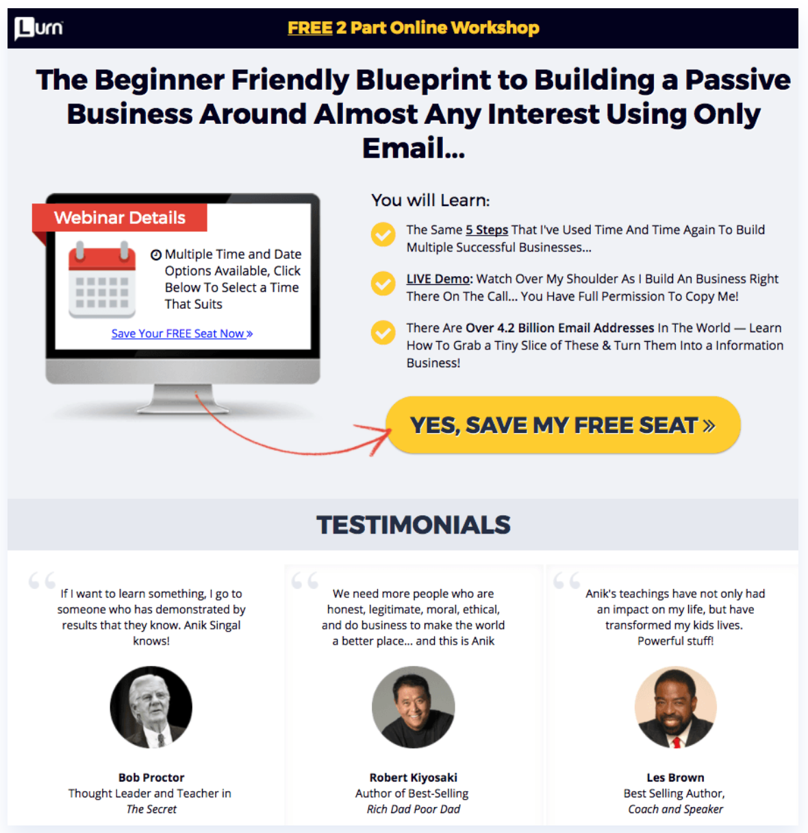
Lurn uses formatting techniques such as colour, bolding, and underlining to build a visual hierarchy to direct our eyes and attention to the most important aspects of their landing page.
| TAKEAWAY Your landing page copy will always be a work in progress. It is important to continuously A/B test with the goal of constantly improving your conversion rates. |
4. Social Proof and Trust Indicators
Potential customers need to be able to trust your brand before they decide to convert on your offer. That’s why incorporating trust indicators to add credibility is essential to your landing page.
By including social proof on your landing page, you decrease doubt in the reader’s mind by adding credibility to your offer. Reading about the experiences of real people and companies can positively impact their buying decisions.
Here are five common ways to add trust indicators to your landing pages:
Statistical Evidence: Getting your visitors to convert often relies on providing statistical proof that your service is the solution to their problem.

Teachable shares that they’ve had over 100,000 creators host online courses with them, generating over $1 billion in collective revenue. Sharing these numbers is powerful as it provides statistical evidence firstly of users to the platform and secondly of their users' success.
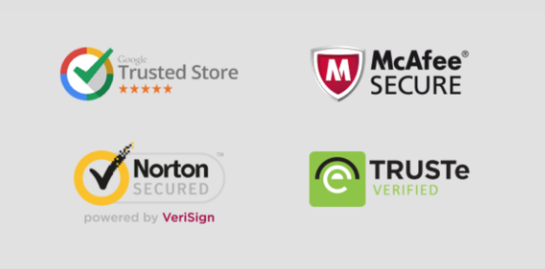
Trust Badges: Authority badges can include awards from other organisations, customer logos, accreditations, certifications, recommendations and more. Badges that indicate trust from a third party provide the reader with an unbiased recommendation and will encourage them to feel that they are in safe hands.
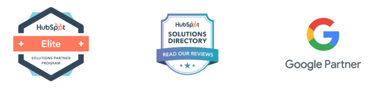
Struto uses authority badges to give the reader confidence that they can trust Struto with their business.
Testimonials: Word of mouth is one of the most powerful marketing tools out there. A happy customer testimonial recommending your offering is a form of this. Be sure that when you’re showing reviews or direct quotes, you provide as much information as possible (full name, business, title, headshot), as this makes the testimonial much more credible to the visitor seeing it.
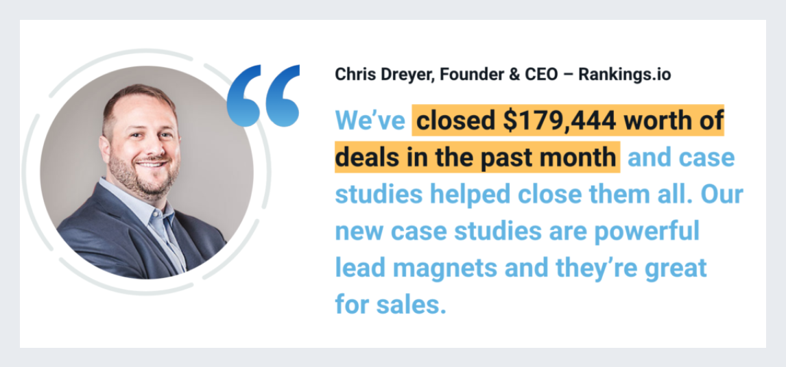
Case Study Buddy have perfected the use of client testimonials on their website. Notice how they provide the name, title, picture and company of the client, and the statistical evidence is highlighted to draw emphasis.
Third-Party Seals: Third-party seals let your visitors know that doing business with you is safe and their information will not be shared or compromised. These help build trust and reassure customers that they are safe to convert. Security is becoming more critical, and these seals provide third-party approval to settle any doubts that you are a trusted source.
In essence, social proof and trust indicators are signposts to the reader that others have bought, consumed and approved of what you have to offer. These help lower the barrier of resistance that potential clients may have when they click on your landing page. Adding social proof is one of the best ways to convince potential customers that your product or service is right for them.
| TAKEAWAY When it comes to using social proof, there are two important things to remember: 1. Don't create false social proof or make up testimonies. Not only is it bad practice, but when people sense that you are being deceptive, they will lose trust in you, and you'll have a hard time trying to win them back. 2. Be specific. Always state the who, what, when, why, and how of your customer's experience. Testimonials are most effective when your prospects can identify with the people giving them. |
5. A Call-To-Action
Now we’re at the most essential of the landing page elements: your call-to-action button.
The CTA is important because it helps make your landing page goal a reality. It must always stand out so that visitors know exactly what they need to do to complete the action to get their offer.
Here are a few factors to consider when designing your CTA button:
Positioning: By placing your CTA button too early on the page, you’ll risk losing conversions as not enough value has been built yet. When you place the CTA after you’ve introduced and explained your offer, visitors will be more likely to convert.
Colours: To really make your CTA button stand out on your landing page, it needs to contrast well with the rest of the page. That doesn’t necessarily mean bright colours, either. Consider A/B testing your CTA to help you decide on a hue, tint, shade, and tone that stands out from the rest of your page and draws maximum attention.

In summary...
We've shown you 5 essential landing page elements, along with examples of organisations already using them effectively. Although there's no one-size-fits-all formula for landing page success, these elements provide a solid framework to keep in mind as you create your new landing page.
Include these 5 elements on your own page, and you can be sure of a structured landing page that is more likely to convert your website visitors.
